WEB POSTER EXHIBITION - Mieczyslaw Wasilewski
A short introduction
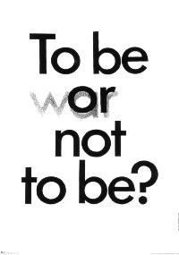 Mieczyslaw Wasilewski is best known for his poster "To be or (war)
not to be?", which he entered in a competition for a poster for the
anniversary of the victory over fascism, and which first won an award
for best poster of the month in Warsaw, in May 1975, and then the gold medal
at the 6. Warsaw Poster Biennale 1976. As Janina Fialkowska recounts
in the catalog of the award winners in 1978, it is the outcome of discussions
held at the International Typographic Congress in Warsaw, which
apparently also directed the interest of other polish designers towards
typography.
Mieczyslaw Wasilewski is best known for his poster "To be or (war)
not to be?", which he entered in a competition for a poster for the
anniversary of the victory over fascism, and which first won an award
for best poster of the month in Warsaw, in May 1975, and then the gold medal
at the 6. Warsaw Poster Biennale 1976. As Janina Fialkowska recounts
in the catalog of the award winners in 1978, it is the outcome of discussions
held at the International Typographic Congress in Warsaw, which
apparently also directed the interest of other polish designers towards
typography.
This poster, or maybe the award, forms the starting point of a
development where Wasilewski abandoned color more and more, even bannishing
grey tones and keeping only black and white or sometimes yellow. It also typical
for two more characteristics of his style - the concentration on the absolutely
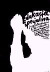
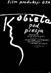
essential - and the masterfull use of typography. Here are some more examples
that show how text can be an integral or even dominating part, not just a visual
appendix, of a poster:

Not all of them are as easy to grasp as "To be or (war) not to be?", and I
must confess that for a long time I was just puzzled by the strange looking
characters in "Most na rzece Kwai"
until my friend Jacek Jaroszyk translated the title to me and pointed out
that the characters MOST (the polish word for "bridge") form the pillars of a bridge,
which are reflected in the water. It also took me a while
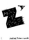
to realize that the eye in the exhibition poster for Andrzej Zwierzchowski
is the initial "A" and then still another moment to decode the object at which
the eye is staring. These are most enjoyable "Aha" experiences, but how is
Wasilewski going to adress the driver in a car who needs to be convinced
in a split second to buy a pack of cigarettes, or see a movie?
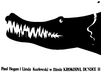 Lets see how he handles the potential movie goer. Since you probably saw "Crocodile Dundee 1"
already, the love story between a rough australian crocodile hunter and his
New York girlfriend, all you need is a short but emotionally powerfull reminder
to see the sequel. But, looking at the poster after the show, did you
notice the trophy hanging around the smiling beasts neck, all that apparently
remained of the hapless Bikini clad bather ? Or did you rather see the profile of her
face ? And did you have a closer look at the gruesome teeth and suddenly
discover parts of the New York skyline in it?
Lets see how he handles the potential movie goer. Since you probably saw "Crocodile Dundee 1"
already, the love story between a rough australian crocodile hunter and his
New York girlfriend, all you need is a short but emotionally powerfull reminder
to see the sequel. But, looking at the poster after the show, did you
notice the trophy hanging around the smiling beasts neck, all that apparently
remained of the hapless Bikini clad bather ? Or did you rather see the profile of her
face ? And did you have a closer look at the gruesome teeth and suddenly
discover parts of the New York skyline in it?
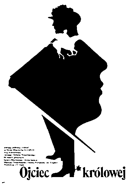
You will often find surprises like these in Wasilewski's posters and he apparently
enjoys to burry hidden treasures in his pictures. One of his specialties is the use of
the negative image to introduce the profile of a face in unexpected
places:
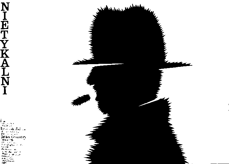 I will conclude this short introduction with my favorite poster, "Nietykalni",
("The untouchables") for an american film on the Mafia. It comes to my mind whenever I hear somebody
complain that the printer has ruined his beautiful design, that the paper
quality is so poor that even a good printer can not print a decent poster on it, that
these days you need a big computer and expensive software just to keep up with the Japanese,
and in addition a layout coordinator, creative assistant and design consultant in your team,
and so on. For me, this poster is the living counter example that it is possible to
express an idea with almost nothing but a sharp mind, and do it in an elegant and
powerful way on top of it.
I will conclude this short introduction with my favorite poster, "Nietykalni",
("The untouchables") for an american film on the Mafia. It comes to my mind whenever I hear somebody
complain that the printer has ruined his beautiful design, that the paper
quality is so poor that even a good printer can not print a decent poster on it, that
these days you need a big computer and expensive software just to keep up with the Japanese,
and in addition a layout coordinator, creative assistant and design consultant in your team,
and so on. For me, this poster is the living counter example that it is possible to
express an idea with almost nothing but a sharp mind, and do it in an elegant and
powerful way on top of it.
go back to main page
page last revised on November 11, 1997
/