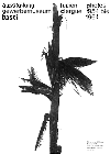
 The road to Basel, typographic reflections by students of the typographer
and teacher Emil Ruder
The road to Basel, typographic reflections by students of the typographer
and teacher Emil Ruder
The road to Basel, typographic reflections by students of the typographer
and teacher Emil Ruder
Concept and design Helmut Schmid;
published by Helmut Schmid Design, Osaka (J) (1997);
96 pages, about 100 black and white reproductions, 26 x 26 cm, hardcover;
ISBN 4-947613-42-4; 5500 Y (about 40 US$); in german, english, japanese;
distributed by Robundo Publishers, Tokyo (J), Fax +81-3-3352 5859
Emil Ruder (1914 - 1970) was, together with Armin Hofmann, one of the founding fathers of the so-called Basel School. He was hired in 1942 by the Allgemeine Gewerbeschule of the swiss city of Basel to teach typography to typesetter and printer apprentices, and was joined in 1948 by lithographer Armin Hofmann.
The two quickly extend their courses and gained an international reputation, peaking in an advanced class for visual communication in 1968. Already before that time, the school attracted talented students from all over the world and could be rather picky in whom it accepted. Some students of Ruder had to wait up to three years to get in, as he took only two or three students each year.
Helmut Schmid, a graphic designer now working in Osaka, was one of them. He has asked his former classmates to recount what brought them to Basel to study typography, and collected their short essays in this book. To write of one's journey and its motives is a very personal matter, as one of them, Andre Guertler, remarks, and so this is an intimate book, funny and sad as life itself. Above all, it shows the profound admiration of Ruder's students for their master's personality and character.
It is also a source on Emil Ruder's teaching methods and design philosophy. Asymmetry as a concept was important to him, and he saw support for it's universal validity in japanese texts on Zen philosophy and the art of drinking tea. On this idea, he apparently differed from Jan Tschichold, who was also working in Basel at that time, as typographer for the pharmaceutical company La Roche. Ruder's student Ake Nilsson recounts somewhat perplexed that "In Ruder's drawer were examples of poor work from, among others, Jan Tschichold, who was held in high esteem in Sweden". Wolfgang Weingart, another Ruder student from 1964 onwards and one of todays typography greats, tells us how he was almost expelled from the school for his "destructive attitude". Exciting times indeed for typography in Basel.

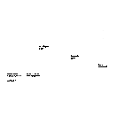
Japanische Kalligraphie und westliche Zeichen 1956, Emil Ruder Poster for an exhibition on japanese calligraphy and western signs at the Kunsthalle Basel |
Die Zeitung 1958, Emil Ruder Poster for an exhibition on newspapers at the Gewerbemuseum Basel |
Lucien Clergue, photos 1954 bis 1964 1964, Emil Ruder Poster for an exhibition of photographs at the Gewerbemuseum Basel |
An extensive preview, with many pages reproduced from the book, is shown in the current issue of Typographische Monatsblaetter (Nr.3/1998), with a moving contribution from Hans-Rudolf Lutz, written shortly before his death in January 1998.
But I am glad to have the whole book, not just an excerpt.