WEB POSTER EXHIBITION - 8. Tehran International Poster Biennial 2004

My choice

Having high respects for the opinions of the interantional juries, and this one in particular, I nevertheless feel free to voice my own subjective opinion, a sort of one-man "critics" prize. Not having any judging criteria, except that I avoid posters that have already appeared on the Poster Page, I try to explain below what caught my eye.


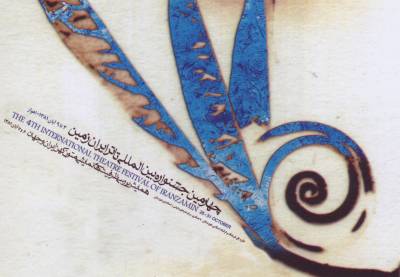
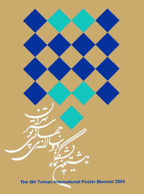
Biennale poster by Mostafa Assadollahi (IR)
The Biennial poster by Mostafa Assadollahi, during many years a board member of the biennale organizing commitees, is one of the three that I liked most, although it was of course out of the competition.

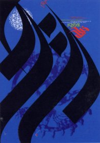
It also is used as the Biennale logo, and is perfectly clear: The squares remind me of the many posters that are submitted, a few of them are outstanding, one is eventually picked. The colors are those of the country, the sand of the desert and the beautiful ceramic tiles.

Finally, if you have to sum up the difference between latin and iranian typography, you need no words, this posters says it all.


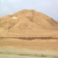
Between Tehran and Kashan 
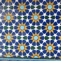
Tiles on the Golestan Palace, Tehran


Poster by Sabina Oberholzer and Renato Tagli (CH)
I saw the poster at left for an exhibition of the korean-american artist Ming Jung Kim for the first time when I visited the Odermatt & Tissi studio, and it felt like a punch in the eye.

Posters for somebody else's exhibtion are always a touchy subject, and rarely win a competition prize, but this poster goes far beyond mere reproduction of the artists work. Without being provocative, it gets immediate attention against any background.

Simple, strong, original, clear.


Poster by Saed Meshki (IR) for the 4th International theater festival of Iranzamin
What I like about Saed Meshki's posters is their rich texture and their mysterious poetry.

I don't understand the symbols in this particular poster, never mind. It looks like a branding iron, and Saed told me that fire is one of his favorite symbols, standing for Love.

Fish is another of his symbols that appears in several posters, meaning the trip to the ocean, yearning for far away countries, travel, escape from the daily grind.

Anyone who thinks and works in these categories has my sympathy.


Detail


Andrei Logvin (RU)
for a live performance of the music group "Mousetrap"
What a sense of humour

Niklaus Troxler (CH)
Concert poster for Jazz in Willisau, Simon Nabatov Pianosolo
Standing directly behind the pianist

Mehdi Saeedi (IR)
18th Fajr International music festival
Making a breath visible

Karl D. Geissbuehler (CH)
Theater poster "The silent woman"
Clever idea, powerful execution

Cyan (DE)
Concert poster for the event "Singuhr"
Love of latin letters

Reza Abedini (IR)
Movie poster for "Reve des sables"
Low tech poster with high impact

Werner Jeker (CH)
Exhibition poster "Louis Soutter"
Bringing out a photograph

Bijan Sayfouri (IR)
Khiyal, The Quarterly of the Iranian Academy of Arts
Love of iranian letters

Intro Winners My choice Morteza Momayez Posters & designers Biennial Accompanying Exhibitions Street graphics Summary


home  previous exhibitions  page created on July 26, 2004 / this section is part of Rene Wanner's Poster Page /