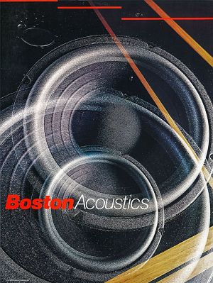
Boston Acoustics Loudspeakers, offset, 1980
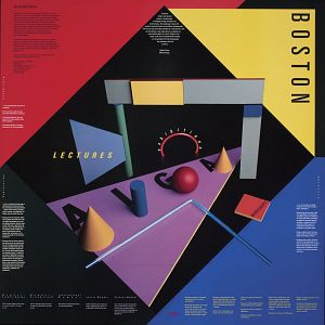
AIGA Boston. Lectures, exhibitions, workshops, offset, 1983
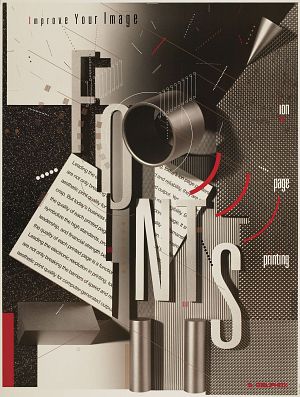
Delphax Fonts. Improve Your Image. Ion page printing, offset, 1987
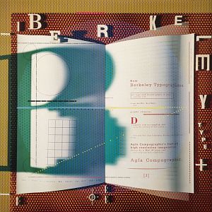
Berkeley Type +, offset, 1989
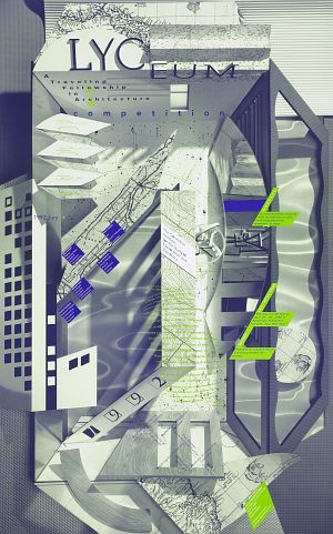
Lyceum. A Traveling Fellowship in Architecture. Competition 1992, offset, 1992
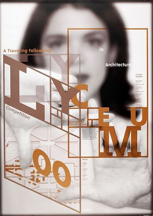
Lyceum Competition. A Traveling Fellowship in Architecture 00, sitodruk, 2000
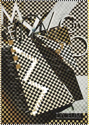
Lyceum Traveling Fellowship in Architecture 07, sitodruk, 2007
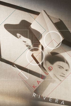
Kahlo Rivera 100, sitodruk, 2008
The presence of Nancy Skolos and Thomas Wedell, a duo of American graphics artists, in the PERSONA exhibition series, devoted to world-famous poster designers, may seem unusual, but only from the linguistic point of view. This is the first time the presented PERSONA is in fact two persons, but a closer look at their posters and cooperation helps one find ample justification for presenting them in this particular cycle. The posters of Nancy Skolos and Thomas Wedell are intriguing and complex images, whose composition poses a challenge for the audience. We have already got used to being "forced" by designers to decipher their message, but in this case we are also faced with illusionist riddles in the form of three-dimensional depth created on a two-dimensional sheet of paper.
The graphic artists from Massachusetts are known to a relatively small circle of people in Poland, mostly to poster design specialists or other poster artists, who could only their original works during the International Poster Biennial in Warsaw, organized every two years since 1980. A slightly larger exhibition of their works took place in 2012 in Warsaw during the exhibition of the Laureates of the 22nd International Poster Biennial 2010 (the authors received a Gold Medal in the "Chopin Anew" special category). The selection of posters from the Persona exhibition, covering their 30-year-long cooperation, provides a relatively full image of the development of their style, which constantly changes despite the use of almost the same techniques for most posters.
They first met in the mid-70s in one of the more interesting American schools for artists, The Cranbrook Academy of Art. The Academy, located in the picturesque city of Bloomfield Hills, Michigan, is known as the cradle of the American modernism. The famous Finnish architect, Eliel Saarinen, was involved in its establishment, both in the architectural and curricular sense. The Cranbrook Academy of Art, with its first courses beginning in 1920, was initially inspired by the vision of the English Arts and Crafts movement from the second half of the 19th century, whose ideology spread across Europe and the United States. When Nancy and Thomas studied there, the curriculum of the Academy was very original, pioneering, and based on the idea of interdisciplinarity, advocated in the 1970s by Katherine and Mike McCoy. Nancy once described the atmosphere of the Academy in an interview:
The design department itself was completely interdisciplinary. Students could participate in 2-D and 3-D assignments and the cross-fertilization among the interior, product and graphic design students led to mutual understanding of design problems. The best part about it was that the McCoys constantly reinvented the theoretical constructs. They never stopped searching and thinking. They created an environment and attitude that has stayed with most of us throughout our entire careers and lives.
After two years at the design department, Nancy Skolos continued her education in graphic design, where she encountered "harsh criticism" on the part of other students on the one hand and their enormous creative force and experience on the other, which turned out to be a positive educational experience. Having graduated from the School of Architecture and Design in Michigan, Thomas Wedell began his education in Cranbrook at the photography department, which was a completely new course at the University. He also very early started his cooperation with the design department: In my second week at Cranbrook, I ran into Kathy McCoy who needed some photos taken. That's how I started working in the design department taking photos, first for Kathy and Mike McCoy, and then for everyone else. I became very involved in the design department. The education of Thomas Wedell, stretched between two areas of art, finally led him to the graphic design department, where he continued his study. After graduating from the University, he continuously deepened and broadened his knowledge of photography techniques by learning about the new technology of computer and digital photography.
Nancy and Thomas met at the University, but did not plan on working together from the start. Their cooperation resulted from the need to spend time together. Having graduated from the University, which provided Nancy with great freedom of experiencing many different disciplines, she continued her education at the Yale University School of Art to gain a solid theoretical background on graphic design. During that time, she was asked to prepare posters for the Yale Symphony every two weeks. In order to spend more time with Nancy, Tom started working with her, which turned out a very positive experience and provided the first impulse to start a studio together. The studio was initially located in Boston, because they wanted to stay at the East Coast and maintain the numerous acquaintances and friendships from the University. It also resulted from a rational assessment of their financial capabilities. They got their first orders thanks to the people they met in school. This was also the case with the Boston Acoustics company - they were recommended by a friend from Cranbrook, a product designer. Their cooperation with this company lasted for the next 10 years.
A poster from 1982, advertising the Skolos, Wedell + Raynor studio, contains the most characteristic features of their design - a collage of geometric and typographic elements. The two-dimensionality of a sheet of paper is expanded by a virtual third dimension, created by the depth of photographic image. The integral fusion of spatial forms with graphical elements results in a completely new image, a combination of architecture, design, and photography. The initial core of the newly-created studio in Boston included three persons: Nancy Skolos, who was responsible for design, Thomas Wedell, taking and planning photos, and Ken Raynor, a friend from school in Michigan and Cranbrook who cooperated with them in photographic sessions.
The themes of their posters reflected the orders, the authors of which were mainly companies dealing with new technologies, such as Digital Equipment Corporation, Prime Computer, Boston Acoustic. Designing posters for companies implementing the first computer systems in the 80s must have been difficult, as it was related to a completely new and unknown area, while the role of the designer was to convey a clear and visually appealing message about the product. The authors recall their work on one of such posters (All-In-1. Information systems that grow with you): In the early eighties, the term 'software' was very new to the most people and we were constantly challenged to visually represent what that was. We mixed in iconic images such as a chambered nautilus shell to represent system that could grow and expand - often placing these object in unexpected settings to evoke the surreal aura surrounding the new technology.
Together with the gradually growing number of orders, the studio in Boston was growing as well. The maximum number of persons, 9 in total (3 photographers, 3 designers, a production manager, and an accountant), worked there at the beginning of the 1990s. They invested a large part of their income in the development of the studio - the purchase of more technologically advanced equipment - in order to expand the scope of their activity. The decision to make the Skolos/Wedell. Interdisciplinary Graphic Design and Photography Studio smaller was consciously made by the artists and "supported", as Thomas put it, by the recession of the 90s. This change was also associated with their growing involvement in teaching - first of Nancy Skolos, then of Thomas Wedell as well.
One of their most important projects from 1992 is the book "Ferrington Guitars", in which they managed to achieve a perfect merger of typography and photography, creating a completely new book/album design. This title, published by Callaway Editions, presented 51 hand-crafted instruments by Danny Ferrington, who made guitars for many famous musicians (e.g. Pete Townshend, The Who, Eddie Van Halen, Elvis Costello, Richard Thompson). The work on this 122-page book began with a series of meetings with the master luthier from Los Angeles, who told them about guitars and music, sent them to concerts, and educated them, transferring a large dose of emotions resulting from his love of guitars at the same time. All that was reflected in the composition of every page of their book. In between the concerts, the musicians would let Thomas photograph their guitars at different angles, in various configurations, and using diverse settings. These photographs constituted only a starting point for the creation of the book, which featured the then-innovative method of digital image processing, enabled by the Kodak Center for Creative Imaging in Camden, where they would drive for 4 hours for 15 consecutive weekends to work sitting together in front of a single computer.
The biggest challenge was keeping an exciting pace of energy through 128 pages of guitars without having them look repetitive. There had to be a surprise every time you turned the page. The cover was the high water mark in our layering style. But inside of the book is a whole new direction in design experimentation.
When creating the photography layout for centerfolds, they would leave a lot of space for texts, which were later typographically integrated in such a way, as not to overwhelm the image of the guitar. The contents of the book were complemented by its unusual trapezoidal shape, reminiscent of a guitar fingerboard, and a multilayer cover containing a CD with music played on the Ferrington guitars presented in the book. The production was very long - starting from the Laserscan prepress in Phoenix, through the Graphic Art Center printing house in Portland, Oregon, ending with the Nicholstone bookbindery in Nashville. Still, when Nancy received a package with the finished book after three months, it was one of the most creatively satisfying moments of her life.
The posters sent by the authors to various exhibitions over the last 30 years depict their characteristic, personal style, which makes it possible to identify all their posters without even reading the signature. Nancy Skolos and Thomas Wedell have worked in the same way for years, complementing each other and almost reading each other's minds. When talking about their mutual communication in an interview, Thomas gave the example of their complete lack of preparation before joint lectures, after which the participants usually ask how long they had practiced to achieve such an astonishing effect. This duo of graphic artists is defined by an excellent distribution of technical skills and features of character, which enables them to complement each other when working on a single project. Nancy Skolos is not a very spontaneous person. She works according to her plan - thinking fragmentarily at first, just to combine all the parts into a complete idea at the end. She is also responsible for making the final decisions regarding design, typography, and sometimes color as well. Thomas Wedell, often referred to as Mr. Concept, has a completely different approach to work - he likes telling stories and lets his ideas unfold in real time, second after second. He introduces narration to the design and makes all the decisions related to photography, filters, and lighting. They both emphasize that the starting point for many of their works is collage, a technique used by them for a long time. It has remained largely untouched by technological development, which is included at the very end of their creative process. The basic tools include pieces of paper of various color and texture, sticky tape, and scissors. They also often check their drawers for old collage works, which they use as inspiration. Their projects, despite the stories hidden within, are architectural in nature, which results from their great and long-lasting inspiration and fascination with architecture, that they picked up in Cranbrook through the very experience of its influence.
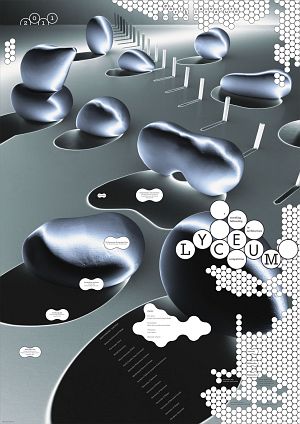
However, the most interesting posters have been designed since the 1980s for the Lyceum Fellowship, the organizer of an annual architectural competition for students. Every year, the Lyceum Fellowship Committee invites selected schools educating future architects from around the world to participate in a competition, the program of which is prepared by outstanding practitioners in the field of architecture. The winning projects are not really implemented, but the first three places receive significant financial prizes. The winners are chosen by a jury, whose composition changes each year. The number of posters printed for the consecutive editions is limited. Recently, they have also been distributed to all the participants of the competition in digital form. This visual medium communicates only the basic principles of individual editions, without suggesting any solutions or providing any information concerning the factors taken into account by the jury during the selection of works for the competition. The complex structure of these posters constitutes a type of visual riddle, despite the initial impression of purely abstract improvisation. When it comes to their composition, there are no permanent elements. Only the format was standardized, and since 2000 they have been printed in accordance with the Swiss standard (weltformat - 128 x 90.5 cm). The content of the title is also unchanging, always including the name of the organizer: Lyceum / A Traveling Fellowship in Architecture / Competition, accompanied by the current date. Moreover, each poster includes the names of the schools taking part in the competition, the members of the jury and organizational committee, information concerning the prizes, and short descriptions of the design principles of the particular competition. The posters contain a lot of text and, in conjunction with the small font, the content becomes readable only in direct and close contact. All the compositional elements, including the text, are in the form of a collage with a virtual third dimension, creating the impression of space and depth. The utilized technique, based on partially overlapping layers enriched by spatial models photographed by Thomas Wedell, is very complex and its initial phase reminds one of the work of an architect or a sculptor. The elements of this collage structure, apart from the traditional pieces of paper of different texture and typography, treated as a flat graphical element, also include more spatial items and fonts, constructed especially for the needs of the composition and then photographed. Even the light used for photography forms colorful patches, created by the spatial models casting shadows on the surface.
The audience does not have access to the long creation process of each poster, but under close examination it is possible to see that the image was not generated by any computer software, such as Photoshop - that it is a more intricate and challenging visual structure. It is not uncommon for the posters which are capable of grasping the viewer's attention for more than just a moment to have a deep and complex design structure. The process of achieving its final form is long and arduous, which does not mean that it is not pleasurable for the authors.
In one of the most recent books by Nancy Skolos and Thomas Wedell, "Graphic Design Process. From Problem to Solution", the authors describe in detail the process of creating a poster based on selected works of several graphic artists. The stylistic diversity of individual compositions, either very complex or minimalistic, proves the intricacy of the graphic process. Both the seemingly minimalistic black and white poster by Ralph Schraivogl, Live / Evil, and the very complex Lyceum 2010. Traveling Fellowship in Architecture. 25th Competition by Skolos + Wedell took a long time to complete. The poster selected by the authors from their own works came from the series created for the Lyceum Fellowship. In 2010, the architectural program was focused on the design of the International Community Center in Abuja, the capital of Nigeria. The graphic artists, therefore, decided to combine the richness of the Nigerian culture, portrayed in the form of a mask, with the architectural subject matter. As usual, their starting point was collage, which this time evolved in two directions. One of them was the three-dimensional form of paper models based on the geometrical shapes of African masks, the other - abstract architecture represented by two-dimensional paper collage. The next stage was to construct a three-dimensional model of a mask - first made of paper, then laser-cut from plexiglass. Its individual parts were later covered with paper of different textures and put together to form a single model. Building the model is just the first step in creation of a poster. The next stages include photography with the use of local and dispersed lighting and the final assembly of the poster using a computer .
The series of posters for the Lyceum Fellowship, created from the 1980s to 2013, exhibits a significant development in terms of style. The posters from the most recent years are complex collage structures perfectly combining fonts and images. Especially interesting is the very personal approach to specific architectural subjects and the attempts of transferring them into images, as well as the inclusion of the 'LYCEUM' typography, new and adjusted to every design, at the same time identifying the name of the organizer.
Since the early 1990s, teaching has become increasingly more important for Nancy and Thomas. From the very beginning, they have been in close relations with the Rhode Island School of Design in Providence, where Nancy Skolos worked for a short time, not being sure of her future as an educator in this field at that time. After years of working with students, her attitude changed. She became a professor and took a senior position at the Graphic Design department. She also started gaining enormous satisfaction from her contact with students, which was based more on partnership than on the master-student type of relationship. In one interview, Nancy Skolos tells an interesting story concerning her change of attitude towards teaching: "I'm not really a natural-born teacher. I never feel that I know enough. I don't feel like I'm a real authority on anything. It's just not my nature to expound on things. I think that's probably why I felt ambivalent. The class I always taught at R.I.S.D. was an elective course in posters design for seniors and grad students. One year I was asked to fill in for a sophomore course. The more teaching I did, the more rewarding it was because I could see the students progress from sophomores to seniors; I really enjoyed the whole nurturing aspect of the job. Since I took the full-time position, I've learned more than I experienced in my whole college education. I almost feel guilty that they are paying me. My mind hasn't been this happy in long time. It's fun at my age to try something so new and see that you can grow. I now get an almost bigger thrill out of designing a really successful assignment for my students than I do from designing a project of my own." They both notice that their involvement in teaching widened their perspective with regard to their own projects and improved their contacts with customers thanks to increased awareness and the ability to listen to others. They are also critics and authors of problem books devoted to graphic design, the most important being "Type Image Message. A Graphic Design Layout Workshop" (2006) and "Graphic Design Process. From Problem to Solution 20 Case Studies" (2012).
The first attempt of naming the style of Nancy Skolos and Thomas Wedell was made in 1993 by Mike Hicks in the "Eye" magazine, who described them as "techno cubists", referring to the combination of layering images, employed for the first time by the European cubists, with a technological approach to design, characteristic of the United States. Jacek Mrowczyk, the author of the first Polish article about the Nancy and Thomas, described their posters in just a few words as an integral combination of image and writing, bound together by illusory space. Regardless of whether we find an original name characterizing the unique style of their work or try to describe it with words, which will always be difficult, the most important distinguishing feature will always be their work methods, gradually blurring the boundaries and divisions between the individual stages of the creative process. "One mind, two bodies" - this phrase, used earlier by the critics of their work, is not only still valid after 20 years, but is constantly becoming even more true.
Anna Grabowska-Konvent, curator of the exhibition
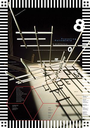
Lyceum competition, Traveling Fellowship in Architecture 08, sitodruk, 2008
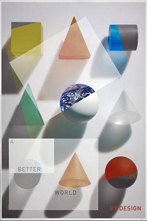
A Better World By Design 09, digital print, 2009
Chopin. 200. rocznica urodzin Fryderyka Chopina 2010, sitodruk, 2010
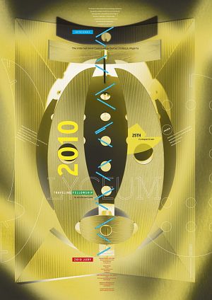
Lyceum 2010. Traveling Fellowship in Architecture. 25th Competition, digital print, 2010
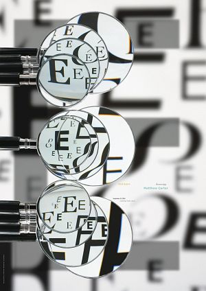
Honoring Matthew Carter AIGA Boston, digital print, 2011
Lyceum. Competition. A Traveling Fellowship in Architecture. Competition 2011, digital print, 2011
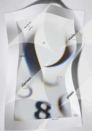
Max Bruch 8 Pieces for viola, clarinet, piano, digital print, 2011