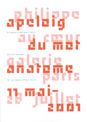
Philippe Apeloig, Exhibition poster Philippe Apeloig at Galerie Anatome, Paris, 2001

Philippe Apeloig, Exhibition poster Philippe Apeloig at Ginza Graphic Gallery, Tokio, 1998

Philippe Apeloig, Musee d'Orsay, Carte blanche, Acces libre, 1987

Takenobu Igarashi, The 15th Summer Jazz Festival, 1983

Takenobu Igarashi, UCLA. University of California, Los Angeles, 1976

Takenobu Igarashi, The Museum of Modern Art, 1984
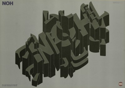
Takenobu Igarashi, Noh. UCLA Asian Performing Arts Institute 1981. Los Angeles - Washington, D.C. - New York, 1981

Tadeusz Piechura, Macbeth, Shakespeare, 1993

Tadeusz Piechura, 1878-1998 Kazimierz Malewicz 120 rocznica urodzin - 1935-2000 Kazimierz Malewicz 65 rocznica smierci, 1998

Tadeusz Piechura, Grand Prix Jazz Melomani '98, 50-lecie Zespolu Jazzowego Melomani, 10-lecie Stowarzyszenia Jazzowego Melomani, 1999
Tadeusz Piechura, Zachod na wschodzie - wschod na zachodzie, 2003
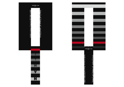
Tadeusz Piechura, Hamlet, przeglad tworczosci, dramaty, Teatr 77 w Lodzi, 2005
Taku Satoh, Exhibition poster The JAGDA Peace and Enviroment Poster Exhibition: "I'm here.", Tokio, 1993

Taku Satoh, Taku Satoh Design Office Inc., 1991 [reklama studia]
Taku Satoh, Taku Satoh Design Office Inc. Neo-ornamentalism, 1991 [reklama studia]
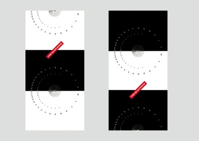
Ruedi Wyss, Music festival in Bern, Ton Art, 1989

Ruedi Wyss, Music festival in Bern, Ton Art, 1992

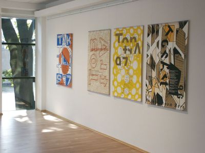
Ruedi Wyss, Festival of contemporary music Taktlos - Bern, Basel, Zurich, 1993

Ruedi Wyss, Festival of contemporary music Taktlos - Bern, Basel, Zurich, 1996

Ruedi Wyss, Festival of contemporary music Taktlos - Bern, Basel, Zurich, 1990
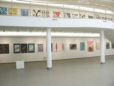
Typo & Construction
This year's edition of the Typo & Construction exhibition, which for the third time takes place in the City Art Gallery in Lodz, this time already in the changed and enlarged exhibition space, like the previous edition of 2000, is confrontational in its character. Choosing the authors for the exhibition we were guided above all by their achievements in the field of typographical design. The Lodz tradition connected with shaping the new typography, recalled in the two previous catalogues, is also essential here, it makes an important background to observation of all novelties and the development of the field of art which is still evolving.
Looking at works, mainly posters (2) of five different graphic designers from four countries, we have a chance to observe the entirely different ways of building the plane of a poster by means of fonts. The works of each of the artists presented at the exhibition are marked by their characteristic personal touch, thanks to which the individual personalities are strongly exposed. Let us observe, in what way each of them started to deal with typographical design and how they develop it.
Philippe Apeloig, the youngest of the artists presented at the exhibition, planned to become a stage designer. He is interested in literature, theatre and contemporary dance and therefore the majority of posters designed by him is made on commission of cultural institutions and organizers of events such as the festival of literature 'Fête du Livre' in Aix-en-Provence or the festival of music and dance 'Octobre en Normandie' in Rouen. In posters which he designs for cultural events, Apeloig not only wants to inform about them but also, through his own interest in the topic, he takes an active part in the given artistic event. What the artist emphasizes himself is that his work right after studies in the Total Design studio in Amsterdam had the biggest influence on his development in the field of graphics.
Since the half of the 80s, when he begins his cooperation with some cultural institutions in France, he has been designing posters, logos and information materials using fonts which he arranges on the plane. In his way of composing parallels between the stage design and choreography and the text layout can be observed. The graphic designer can interpret the text in a similar way as actors or dancers do it. This is the way Apeloig uses fonts. The composition of one of his first and until now the best known posters to the exhibition in Musee d' Orsay in 1987 entitled 'Chicago. Naissance d' une metropole 1872-1922' is based on two equivalent elements: photography and fonts. However, it is typography which is a dominating element in it, it 'tells the story' of the exhibition. This poster is a preliminary stage of his further solutions and search.
Since the time of his studies in Villa Medici in Rome, concerning among other things the innovative role of the Futurist movement, he starts to design fonts so that he could use them in his posters (among others 'Aleph', 1994 - on the poster to his own exhibition in Ginza Graphic Gallery, 'Drop', 1999 - on the poster for the congress centre in Tours, 'Lorraine', 2005 - designed to his own exhibition in Kiev). For Apeloig, the form and function of the applied type in the project must be at the same time attractive and communicative. The empty space in the text, which balances the weight and meaning of fonts, is significant too. In two posters, unfortunately absent from the exhibition in Lodz, designed for the exhibition of ancient boats and barges entitled 'Bateaux sur l'eau, rivières et canaux' and for the economic forum entitled 'Transport fluvial' we deal with the legible typography which at the same time informs as well as plays the role of the clear illustration, defining the subject of the events. The message, profound and attractive, is additionally enriched by the large-format print (175 x of 120 cm). It is worth observing further achievements of this youngest graphic designer presented at the exhibition in Lodz.
Takenobu Igarashi, studying both in Japan and in the United States, is represented at the exhibition by posters which already belong to the history of graphic design. It does not decrease their value, however, on the contrary it shows how important for typography was his research, done by him in the middle of the 70s, where he was concerned with the typographic three-dimensional form transferred onto the plane. His posters are subsequent variations on the same theme, whose creative source is the technique of axonometric drawing. It is this kind of drawing which is the base for all the designs, also the later, three-dimensional ones. Igarashi is concerned with comprehensive design which, in his case, resulted in the cooperation with many companies and institutions, not only in Japan. The double education enabled him to feel comfortable in two cultures and extended the perspective of his work which became more universal in this way.
At first he became known as the designer of three-dimensional fonts, which he used in posters and calendars. In the next stage he introduced them into monumental architectural forms made of metal or plastic. They were sculptures, like in the case of the alphabet made of aluminum, which were presented at many exhibitions, but also frequently works commissioned by some companies which used them to create and develop their own corporate identity and advertisement (e.g. Italian magazine 'Domus', Japanese Santory companies, Meiji Milk Products, Nippon Insurance Company or Nike Ltd.).
On the international arena he is most well-known for his works for the Museum of Modern Art (MOMA) in New York, for which in the 80s he designed among other things calendars and paper bags with the three-dimensional typographical inscription characteristic of him. In the field of the industrial design he is also well-known for a few excellent works which above all are characterized by the wonderful formal minimalism typical of Japanese culture and his characteristic construction approach based on simple geometrical forms. The list of such designs will certainly include the set of cutlery, the stool, the clock in the shape of a sphere and the illumination design 'Lampadina' made for the Yamada Shomei Lighting Company Ltd., the telephone 'Cordless' for the Entex Corporation company and the set of office accessories for Raymay Fujii Corporation.
In all his projects it is possible to observe the artist's individual philosophy of design, in which the design itself is not the only means to solve the customer's problems. What is equally important is the personal vision and understanding what designing is. Igarashi's statement specifies this issue: 'In my opinion there are three fundamental aspects in design: passion, challenge and discovery. Without them designing is boring. With them, the longer and more I work on the project, the more I am excited. The work which brings pleasure also contributes to success.' (3)
His attitude to the modernist formula of Louis Sullivan 'form follows function', according to which it is the form which originates from the function is also interesting. For Igarashi the form is not subordinate to the function but both factors coexist equally and the function should perform the part of the demanding partner that all the time asks questions and redefines problems which arise in the course of designing. Toshifumi Kawahara, describing the profile of the designer, discovers both the architect and the musician in him. For the Japanese graphic designer numbers and letters of the alphabet constitute the twelve tone scale but the axonometric drawing is a kind of organizing compositional methodology. Then, when individual elements are limited in this way, it is possible to create the endless amount of variants presenting numbers and letters of the alphabet. (4)
At present Takenobu Igarashi does not deal with posters or industrial design but he creates abstract sculptures made from different materials, i.e. steel, terracotta, wood which often function in public spaces. We can not see these works at the present exhibition but all the same it is worth having in mind the beginnings of his activity which shows one of the possible ways the designer might take.
The presentation of only a few works of the next author from Japan is not likely to be treated as an individual exhibition. Taku Satoh's posters from the collection of the National Museum in Poznan, are the only typographic works by this author, as it turned out in the course of preparing the exhibition. All of them were created in the first half of the 90s and are worth showing at the theme exhibition like the one in Lodz.
Out of the five presented artists, the Japanese designer is the one who is most involved in advertising and mass production. He gained experience working right after studies in one of the largest Dentsu advertising agencies where he designed a new bottle of whiskey for the Nikka company. Next he opened his own design studio which became the base for realization of all his works, both promoting his own activity and connected with some commissions which often concern the mass production. Satoh is not afraid of such challenges, he does not judge his projects as worse or better, just the opposite, he often treats such designs as a kind of special challenge. Issey Miyake paid attention to the fact that Satoh's designs i.e. a milk carton, chewing gum wrapping paper or cosmetics packages surround people living in Japan in their everyday reality and, what is most interesting in them is the fact that their author emphasizes not a massive nature of this production but the wisdom and the input of work of many people in the process of their creation (5). Taku Satoh, working on a new project, seeks the information concealed in the very product, often refers us to the lifestyle of the consumers and he tries to harmonize it with his proposal.
In 1992, on the occasion of awarding him a prize by the Japanese Graphic Designers Association (JAGDA), in the annual edition they printed a short statement made by the still young designer, who, honoured with the prestigious award, underlines the change he observed in his activity, based on considering what should be done in a given project instead of thinking about what he himself wants to do. Such a tendency of development helps the profound and thorough approach to the corporate image of the customer, which next results in good designs. The ones made by him are characterized by simplicity and minimalism which are visible both in package designs as well as in corporate identities. He uses a variety of techniques and materials which he always carefully selects for a given project. Therefore there are both typographical works and posters based on photography, not shown here (e.g. series of commercials for the Bang & Olufsen company or the set of posters promoting his own studio 'Rebuild / Taku Satoh Design Office Inc.').
In the last few years Taku Satoh penetrates and develops the subsequent area of design, which he has already got the recognition for. He has been twice awarded by 'This one!' in the annual JAGDY reviews for designs of the arrangements of exhibition spaces and the concepts of objects' presentations. Kenya Hara rewarded the design of exposition 'Anatomy of Design' of 2002, and Osamu Fukushima - the exhibition presenting chewing gum wrappings and the full corporate identity of the group of these products. The typographical posters selected for this exhibition demonstrate only the fragment of the area of designer's activity, whose profile is worth individual presentation, especially that graphic design and advertising at the highest level of quality are not a common phenomenon in our galleries.
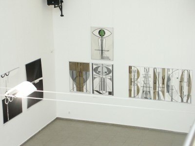
Tadeusz Piechura is the artist well-known in the Lodz environment. He was born and educated here and he has been living here for many years. His works have been shown several times in Lodz at the author's individual exhibitions. The artist's posters in a considerably smaller choice were also presented at the first edition of Typo & Construction in 1996. Zdzislaw Schubert, the curator of that exhibition and the originator of the cycle, distinguished in the Polish poster works based on the expressive typography and the ones closer to rational typography and constructivist tendencies.
At present his latest graphic works, created mainly after 2000, are presented. In these posters, which were mainly published at the author's expense, we observe a really interesting and unusual concept of design. First of all we are surprised by the format of these works, going away from therectangle, traditionally assumed for the poster. The author builds his works in the literal way, juxtaposing and combining individual, printed sheets of paper. His works use the extremely minimal form which at the same time conveys a lot of meaning. They are difficult to exhibit, both in urban spaces, in which the artistic poster is rarely presented, as well as in galleries, because they require the special frame and the way of exhibiting different from the traditional poster.
At this year edition of the exhibition Tadeusz Piechura appears to be a 'great constructor'. His posters, breaking the traditional rectangular format of print require the biggest space and special presentation in multiplied form. Nearly all of them, even the ones referring to theatre, have been created without any special commission, on the author's own initiative, since 1993. An exception to the rule is the poster for Lidia Cankova's exhibition from 1985, whose presence here is intentional for a few reasons. It was the first time when the graphic designer decided on the presentation of a poster in a new, untypical form. Secondly, he perfectly covered the subject of the exhibition constructing the alternating sheets so that they could refer to the matter of the fabric. And thirdly, the author himself is the publisher of the poster.
In the 70s and 80s Tadeusz Piechura made posters on commission (he cooperated with many institutions in Lodz, among others the Museum of History of the City, the Museum of Art, the Museum of Cinematography and with Jaracza Theatre) and they were designs based on a traditional format, they often combined photography and typography, using limited range of colours (at that time white and black had already dominated his work) and, most of all, conceptual generalisation and excellent interpretation of the theme of a poster by simple means of expression.
From these various factors characteristic of earlier works, he still uses two: a maximally simplified colour range and conceptual generalisation. Limiting his use of colours, Tadeusz Piechura simultaneously got rid of the rectangular form restriction, which in case of the poster is connected with technical problems at the stage of printing and exhibition.
The graphic designer builds his posters of a few sheets of paper printed separately which he combines in the right constellations. He sometimes cuts the sheets in order to get a new shape and in this way to emphasize the dynamism of the work. Typography does not dominate these posters because the idea of the work is not based on the selection of the shape of the font. The text on the poster is important in a different way, it is appropriately arranged on the plane, it is sometimes created on the edge of two sheets ('Grand Prix Jazz Melomani '98'), or the font is broken ('Richard III' by Shakespeare) or moved ('Tolerance'). Even the signature on posters is interesting typographically and becomes a kind of the designer's logotype, is a unique identification sign which probably seems unnecessary because Tadeusz Piechura's posters are an exceptional and very individual artistic expression. The fact that they are hardly functional makes us perceive them more as works to be presented exclusively at exhibitions and in galleries, but they are also an important experiment in the field of the poster. They show what printed paper can be and prove that the power of expression is invariably the most important factor.
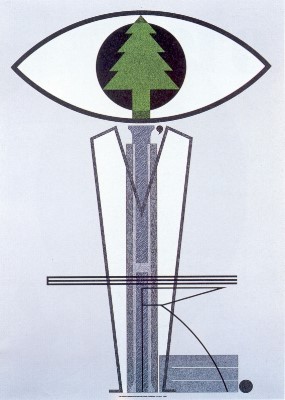
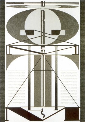
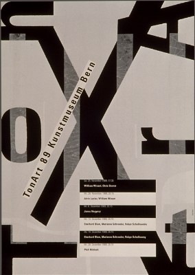
When presenting works from the field of typography it is not possible to omit a graphic designer from Switzerland, a country with a very strong tradition of typographical design. The new generation of designers, which Ruedi Wyss belongs to, questions the rational assumptions of 'the Swiss style' based on the rationality, legibility and functionalism. The education in the field of graphic design which he got in Schule für Gestaltung in Biel was enriched by his own interests in contemporary music.
These two fields were combined in Wyss's work and they resulted in posters which we present at the exhibition. After his graduation Ruedi Wyss ran his own graphic studio for over ten years, however since 1987 he has mostly been concerned with pedagogic activity. At present he is the head of the department of visual communication in Hochschule für Gestaltung und Kunst in Zurich.
The exhibition presents posters from the years 1984-1998 created for three different music festivals organised in Switzerland: 'Taktlos' - a festival of contemporary music and multimedia productions which is held in three cities: Beasley, Bern, Zurich at the same time, 'Tonart' and 'Impro Bern' - festivals of contemporary and jazz music in Bern. All posters are printed with screen process technique in the typical Swiss format (128 x 90 cm). Designed by the author who, when composing them, uses typography which is sometimes supplemented with a photographic image, they became the logo of these events. In many posters for the Taktlos festival he used the Eurostile font from 1962, one of the most important achievements of Aldo Novarese, the Italian designer of fonts. In spite of the fact that it is often broken, up to a point of losing its legibility, and that it appears in different variants, the font becomes the identification of the festival. Choosing this very font Ruedi Wyss wanted to stress (to underline) the European identity in the field of the contemporary music which is more and more dominated by Americans.
The creator of the jazz festival in Willisau - Niklaus Troxler - a much more renowned Swiss graphic designer, who also designs posters for concerts he organises, invited Ruedi Wyss to present the musical posters at the exhibition held by him in Willisau. It was then that he paid attention to the 'improvised' style of some Ruedi Wyss's works which look as if they were created at the last moment before printing but in fact are planned out with a mathematical precision. Their author treated it as the compliment, especially that this statement was made by one of the best graphic designers and a devotee of the avant-garde jazz music at the same time.(6)
Ruedi Wyss almost never participates in numerous poster competitions in the world and therefore his posters are practically unknown outside Switzerland. Nor will we find them, apart from a few exceptions, in international catalogues of big poster events, thus it is worth taking a closer look at them at this year's exhibition.
The five personalities of designers presented in short, whom we have invited to the third edition of Typo & Construction, demonstrate entirely different artistic attitudes. In principle everything makes them different, they do not even belong to the same generation, each of the authors works in accordance with his own principles and interests and it turns out that for each of them typography is a different medium. Takenobu Igarashi and Taku Satoh do not design works in which the font is a leitmotif anymore. Tadeusz Piechura, in his posters from the last years, thoroughly focuses on the text but at the same time he balances it with the plane and the shape of a sheet of paper, the font is one of the components in his projects. For Philippe Apeloig typography is the essence of design, it is in fonts, their shape and placement on the paper surface, that he seeks the inspiration for his work but also in the course of this process he finds new solutions how to inform the viewer at whom the poster is directed. In a similar way Ruedi Wyss seeks the possibility of conveying the message about an event, such as contemporary music festivals, in fonts and in their placement on the plane.
This exhibition which, by definition, is a confrontation of different ways of designing, is composed of posters from the collection of the National Museum in Poznan and of those obtained from the artists. I am particularly thankful to the authors: Takenobu Igarashi, Tadeusz Piechura and Ruedi Wyss who have accepted the invitation to the exhibition and who donated all their sent posters to the collection of the Gallery of Poster and Design of the National Museum in Poznan.
Anna Grabowska-Konwent
Adjunct of the Poster and Design Gallery
National Museum in Poznan, Poland
Endnotes
| 1 | In the first catalogue to the exhibition of this cycle Janusz Zagrodzki wrote about the historical origin of the new style of typography: "Typo & Konstrukcja", Panstwowa Galeria Sztuki in Lodz, 1996. |
| 2 | Unfortunately, despite an attempt to extend the formula of the exhibition, we did not manage to obtain other forms of applied graphics of the particular artists. |
| 3 | Mervyn Kurlansky, Masters of the 20th Century. The Icograda Design Hall of Fame, Graphis Inc., New York 2001, p. 298. |
| 4 | Toshifumi Kawahara, Takenobu Igarashi, Creation" 1990/7, p. 112. |
| 5 | Issey Miyake, Taku Satoh, [ggg Books 65], Ginza Graphic Gallery, Tokyo 2004. |
| 6 | Information obtained from the Internet websites designed by Rene Wanner: www.posterpage.ch |